Showing posts with label minimal. Show all posts

Wednesday, 3 April 2013

website revamp.

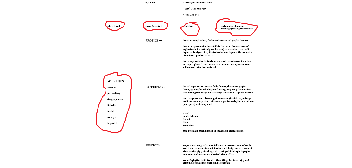
doing it on indesign atm to get the layout sorted etc.
please excuse the black lines around it and shoddy screencap mockup images


index(possibly) / selected projects page


profile & contact page


demonstration of fixed div element on profile page


demonstration of fixed elements on home page


Tuesday, 4 December 2012

progress thing/process thing. might not be in the right order but i'm pretty sure it's in the right order.


12.56.26 pm - 14.28.56 pm
(including long sandwhich and crisps and rice crispies squares break)

i unlinked this one and the one above ^
i cant remember the URL to put the link back in for big version, sorry :(  


Thursday, 1 November 2012

swallow hill alternate business cards

does what it says on the tin.


swallowhill webdesign deux

newly rekerjiggered swallow hill website design.
(right click, open in new window to see the full img properly)

again, that black navbar across the top will only appear once the user scrolls the other nav
bar off the screen- see images below for expamples.


how the website will appear when the user loads it up, no black nav bar.


how the website will appear when it's inuse.


Tuesday, 30 October 2012

swallow hill (quick rough draft) website design

aaaand here's a quick website mockup i did for them, it's super rough and not finalised at all. 
obseve, enjoy, high five your monitor if you like. criticism extremely super welcome!!

i've also attached some cool but unrelated pictures of some anasazi symbols.
the bottom picture is a guy called Kokopelli. they're neat eh?


oh, that black bar at the top will be a fixed div (aka anchored to the top of the page and always
remains there, no matter how far you scroll down the page- for those who don't know what a fixed div is)
the fixed navigation bar at the top will only appear/fade in after the main navigation bar
(the one under the logo) goes off the screen as the user scrolls down the website. also neat eh?


(right click, open image in new window to view the website full size)


Monday, 13 August 2012

website online

http://benjaminwalton.co.uk/index.html

enjoy. not many projects uploaded as of yet, need to get all my bits and bobs back from university and take some photographs! not a fan of the boring flat computer images, need to get things printed off so i can have my work all nice and photographed !

Thursday, 2 August 2012

WEBSITE! going live in 2 weeks

*hopes*
revamped the look of it and i'm much happier with it now.it's based on a five column grid that should fit most monitors. i'm planning to develop a mobile version asap.

please click the photos and have yourself a better look in lightbox mode :)
please be aware that my spelling and grammar is not up to scratch and i still need to check through the site.will make websites for anyone that pays me: email me here


index(home) page

contact is located in footer as well as in my "profile" section. the contact link is all jscript smooth scrolly and flies up from the bottom when you press the navbar button (works on any page of the website)

did a lil copyright information page which opens if you click the link next to the contact. feel free to plagiarise and paraphrase what i wrote, thats essentially how i formed the text. (from lots of official sounding sources)


Friday, 27 July 2012

rekerjiggered the whole shebang !


Today I'm cooking pasta. Butternut squash, pumpkin seeds, tomato sauce stuff, basil and some of those potato things that aren't potatos. Sweet potatoes? Delicious.

Here's a cheeky peek of my website revamp. The text under the lines at the bottom whizzes up from down south once youve scrolled through all of my work and floats over the nav bar and stuff to make it look all important and emphasized. Wowee! Fantastic, right? Inventing little bits and bobs like that makes webdesign proper interesting If only I was more knowledgeable in the ways of the force (jscript) then I could have some REAL fun. Baby steps...practice makes perfect...yadda yadda.. thanks for reading, have a good afternoon!

Tuesday, 24 July 2012

having a crack at making a website for myself

extremely rough version. currently hating everything about it. back to the drawingboard i think! (only used one image so far)


Sunday, 1 July 2012

bang! bang! pew pew pew! gunsligners


Idea sketch for an illustration of some cowboys going bangbangbangbangbang!! I quite like this minimal sketchydoodle version though to be honest.

Wednesday, 27 June 2012

webdesignosaurus!!


Final version of Felix' website done and dusted. Unfortunately only the beta is online at the moment - aaaaaaaaaaaaaaaaaaaa.co.uk (the type is actually meant to be 9, not 12 as it is at the moment) final should be uploadified soon I hope :)

Here's some nice pictures.